How to Create Unique 3D Button in Adobe Photoshop

In this tutorial I am going to show you how to create really cool eye-catching button with custom shapes, ellipse tool and layer styles. Those of you who use lower Photoshop versions should not worry about the 3D effect. It is achived with Spherize Filter and no special 3D instruments are used.
All the steps are very detailed so they can easily be followed by beginners.
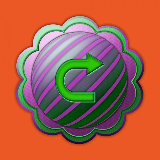
This is the colorful 3D button you are going to create:

STEP 1
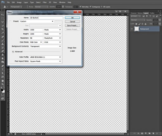
Firstly open your Photoshop version and create a new .psd file of 1000 pixels Width and Height. Call your document 3D button, set the Resolution to 72 or 96 Pixels/Inch, select RGB for Color Mode and also choose Transparent for Background Contents. As a result, you'll get an editable Layer 1 in Layers panel. Double click on its name and type Background in the white rectangle to rename it.
Colorize the Canvas and Drag Two Intersecting Guides
In Steps 2-4 you have to do the easiest work. Firstly you are going to colorize the canvas with Paint Bucket Tool, then we have to create two guides (View, New Guide) intersecting in the middle of the canvas which will help you to place the objects centrally and symmetrically.
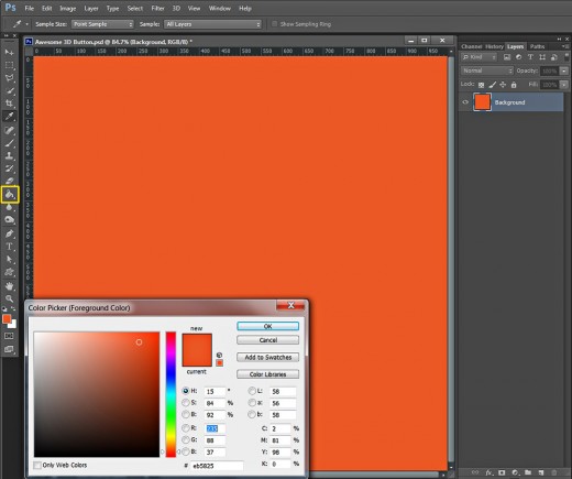
STEP 2
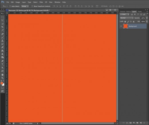
Change your Foreground Color to #eb5825 and use Paint Bucket Tool or Edit, Fill, Foreground Color to colorize your canvas with orange.
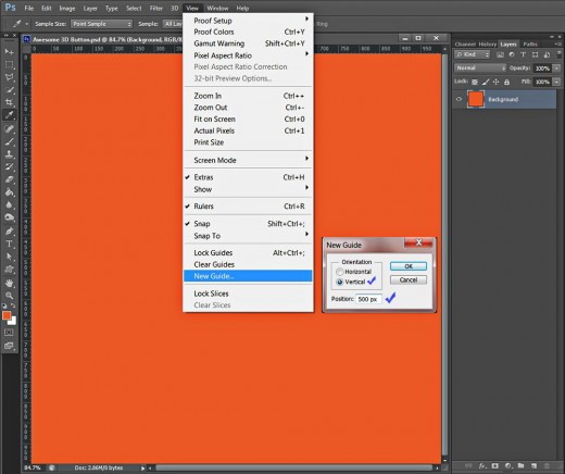
STEP 3
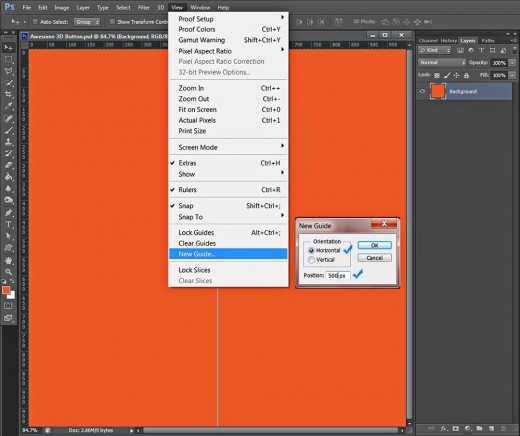
We need to drag two guides which intersect in the middle of the canvas in order to guarantee our precise work. Firstly you should activate the Rulers- go to the Menu bar, select View and check Rulers.
Now we are going to drag the first Guide. Select again View, choose New Guide, in the dialog box select Vertical and insert 500px for Position.
This is how your first guide will look:
STEP 4
In order to drag the second Guide, go again to View, New Guide, but this time select Horizontal. Insert 500px for Position.
Below are shown both guides which will help us to place all button parts in the middle of the canvas:

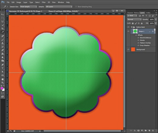
Draw Green Flower Shape to Create the Button Base
In Steps 5-10 you have to draw the first Flower Custom Shape of Fixed Size and green color. You are going to apply four Blending Options to give it volume, Texture and Stroke. The layer styles you have to add to the first Flower Custom Shape layer are Drop Shadow, Herringbone Pattern, Purple shaded Gradient type of Stroke and Bevel and Emboss.
STEP 5
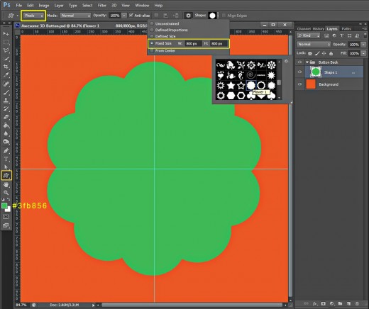
Create a New Layer on top of Layers panel and name it Shape 1. Click on the Folder icon at the bottom of Layers panel (or press Ctrl+G) to place Shape 1 layer in a Group. Rename this new Group 1 to Button Back.
Now change the Foreground Color to green- #3fb856. Grab Custom Shape tool and navigate to the Options bar to change its settings. Firstly change its Mode to Pixels, after that click on the Gear icon, check Fixed Size and insert 800px for both Width and Height. Select also Flower 1 Shape from the Custom Shape Picker.
Draw your green flower in the middle of the canvas. Use the help of Move tool and the Smart Guides (View, Show, Smart Guides) to be more precise.
STEP 6
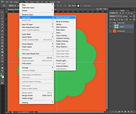
With Shape 1 layer highlighted, go to Layer, Layer Style and select Blending Options to activate Layer Style dialog box. You can do the same if you double click on Shape 1 layer's thumbnail.
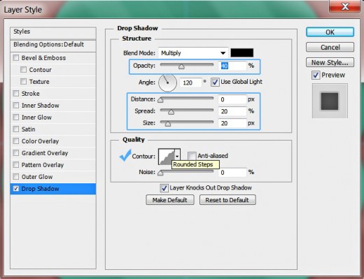
STEP 7
The first Layer Style to be checked in the dialog box is Drop Shadow. Lower its Opacity to 40%, reduce Distance to 0px, then increase Spread to 20% and Size to 20px. Choose Rounded Steps from the Contour Picker.
Don't close Layer Style dialog box yet as we have to add three more Blending Options in the coming steps.
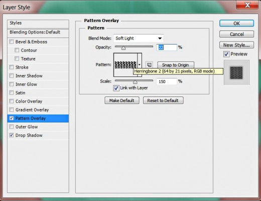
STEP 8
In this step we are going to texturize our first shape so check Pattern Overlay Layer Style and modify its settings as follows:
Blend Mode: Soft Light
Opacity: 22%
Pattern: Herringbone 2 (64 by 21 pixels, RGB mode)
Scale: 150%
Link with Layer: checked.
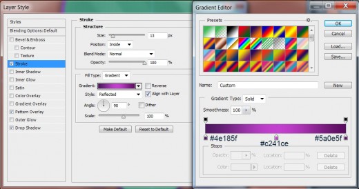
STEP 9
Now we are going to apply this thick purple shaded Stroke:
Size: 13px
Position: Inside
Blend Mode: Normal
Opacity: 100%
Fill Type: Gradient
Change the Gradient Color Stops as follows:
First Color Stop (Location 0%): #4e185f
Second Color Stop (Location 50%): #c241ce
Third Color Stop (Location 100%): #5a0e5f
Reverse: unchecked
Style: Reflected type of gradient
Align with Layer: checked
Angle: 90 degrees
Dither: not checked
Scale: 100%.
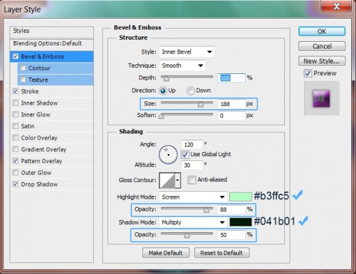
STEP 10
The last Layer Style to be applied on Shape 1 layer is Bevel and Emboss. Change the following five settings:
Size: 188px
Color for Highlight: #b3ffc5
Color for Highlight Opacity: 88%
Color of Shadow: #041b01
Color of Shadow Opacity: 50%.
This is how Shape 1 will look after applying the previously described four Blending Options:
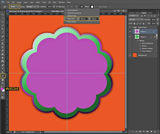
Draw Second Flower Shape of Purple Color and Apply Blending Options
In Steps 11-15 your task is to draw second Flower Shape in Pixels Mode, Fixed Size and purple color. After that you have to add four Blending Options to its layer. You should apply Drop Shadow, Herringbone Pattern, thick Gradient Stroke of green color shades and Bevel and Emboss.
STEP 11
Now change the Foreground Color to purple- #b952b6 and Create a New Layer on top of Button Back group. Name it Shape 2.
Grab again Custom Shape tool and don't change its Pixels Mode. Leave selected Flower 1 shape and set it Fixed Size to 700px both Width and Height. Draw the shape then use Move tool and Smart Guides to place it in the middle of your canvas.
STEP 12
The fun part starts again. We have to add Blending Options to Shape 2 layer in this and the next three steps.
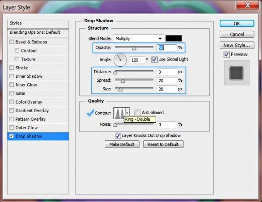
Firstly apply Drop Shadow. Reduce its Opacity to 50%, change Distance to 0px, Spread to 20% and Size to 20px then choose Ring-Double type of Contour from the Contour Picker.
STEP 13
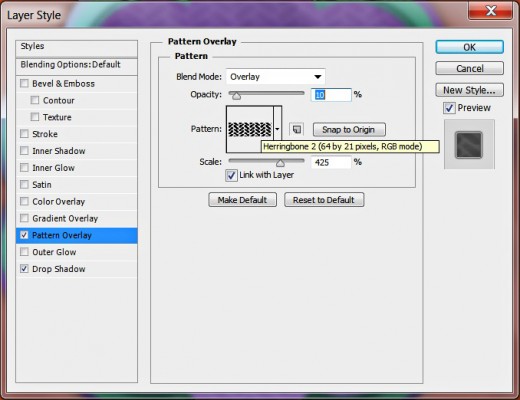
In this step we have to add this Pattern Overlay to Shape 2 layer:
Blend Mode: Overlay
Opacity: 10%
Pattern: Herringbone 2 (64 by 21 pixels, RGB mode)
Scale: 425%
Link with Layer: checked.
STEP 14
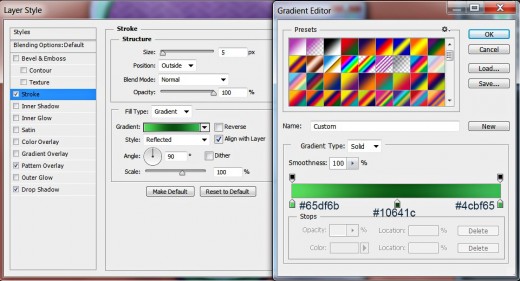
The third Layer Style to be added to Shape 2 layer is this Stroke:
Size: 5px
Position: Outside
Blend Mode: Normal
Opacity: 100%
Fill Type: Gradient
Change the Gradient Color Stops as follows:
First Color Stop (Location 0%): #65df6b
Second Color Stop (Location 50%): #10641c
Third Color Stop (Location 100%): #4cbf65
Reverse: unchecked
Style: Reflected type of gradient
Align with Layer: checked
Angle: 90 degrees
Dither: not checked
Scale: 100%.
STEP 15
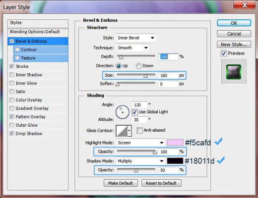
Let us not miss the 3D effect so check Bevel and Emboss in Layer Style dialog box. Increase the Size to 185px, Set Color for Highlight to #f5cafd and its Opacity to 100%, then change Color of Shadow to #18011d and decrease its Opacity to 50%.
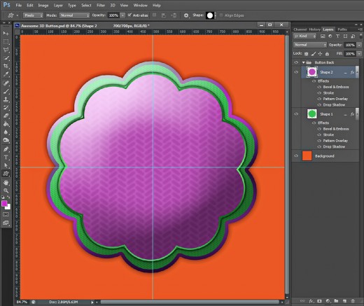
This is how the base of your 3D button will look so far:
Add Ellipse to Create the Central Part of the Button
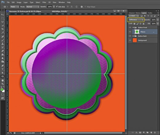
In Steps 16-19 your task will be to draw green Ellipse of Fixed Size then you'll change its Blend Mode to Difference and will add two layer styles to create volume and 3D Effect. Both Blending Options are Drop Shadow and Bevel and Emboss.
STEP 16
Now Set the Foreground Color to this shade of green- #55ad3d.
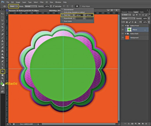
Create a New Layer on top of Layers panel and name it Ellipse. Place it in a group called Button Front.
Select Ellipse Tool with Pixels Mode and Fixed Size of 600px both Width and Height. Draw a green circle in the middle of your canvas.
STEP 17
Change the Blend Mode of Ellipse layer to Difference:
STEP 18
In this and the coming step we have to add two layer styles to the Ellipse layer.
Firstly apply Drop Shadow. Lower its Opacity to 50% and Distance to 0px, then increase Spread to 15% and Size to 9px. Choose Half Round from the Contour Picker.
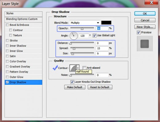
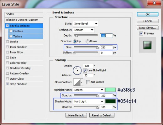
STEP 19
The second and last Layer Style to be added to Ellipse layer is Bevel and Emboss. Increase the Size to 250px, change Color for Highlight to #a3f8c3 and its Opacity to 100%, then change the the Shadow Mode to Hard Light, set the Color of Shadow to #054c14 and also increase its Opacity to 100%.
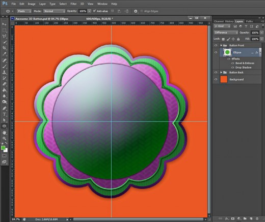
Our Ellipse now has a nice 3D look after applying on it both Blending Options:
Draw Tile Custom Shape and Apply Spherize Filter to Give the Button 3D Look
In Steps 20-25 you have to draw purple Tile default Custom Shape of Fixed Size, then you'll apply Spherize Filter to make the selected part of it looking bulge. You will be using Selection loaded on the previous Ellipse layer, then Reversed, to get rid from the excess parts of the Filter work.
You are going to add also two Blending Options (Drop Shadow and Bevel and Emboss) for more volume and subtle shadow.
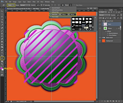
STEP 20
Set your Foreground Color to purple- #ca2fcc and Create a New Layer on top of Button Front group. Name it Tile 2 after the Custom Shape we'll be using right now.
Select Custom Shape tool in Pixels Mode, set its Fixed Size to 700px both Width and Height then find Tile 2 in the Custom Shape Picker. Draw Tile 2 shape as you see on the following screenshot. It is not necessary to be placed exactly in the middle of your canvas.
STEP 21
Keep Tile 2 layer highlighted, then hold down Ctrl key and click on the Ellipse layer's thumbnail to Load Selection.

STEP 22
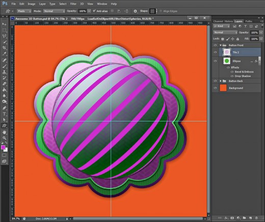
Go to Filter, Distort, Spherize and leave the Amount value to the default 100%.
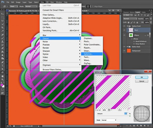
On the screenshot below you can see how the selected parts of Tile 2 Custom Shape have changed as a result of the Spherize Filter. Keep the Selection active.
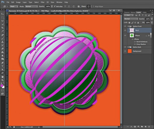
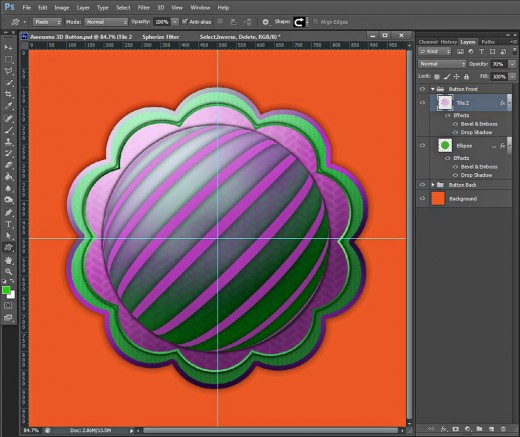
STEP 23
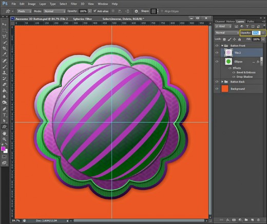
Navigate to the Menu bar and choose Select, Inverse.
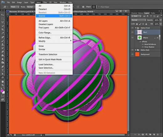
This should be the result on your canvas after inverting the Selection:

Press Delete key to get rid of the those parts of Tile 2 Shape which are included in the inverted Selection, then press Ctrl+D to remove the Selection.
Reduce Opacity of Tile 2 layer to 70%.
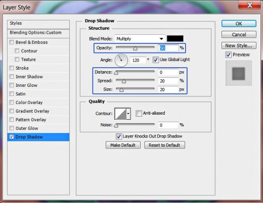
STEP 24
We need to add layer styles to Tile 2 layer. Firstly apply Drop Shadow- change its Opacity to 50%, set Distance to 0px, Spread to 20% and Size to 20px.
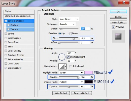
STEP 25
The second Layer Style to be added to Tile 2 layer is Bevel and Emboss. Increase the Size to 185px, set Color for Highlight to #f5cafd and change its Opacity to 100%, then set Color of Shadow to #18011d and lower its Opacity to 50%.
The button body is ready. You should get an outcome similar to my screenshot below. In the following steps we are going to add a symbol to complete our button.
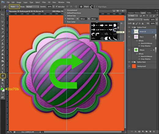
Add Arrow Custom Shape to Create Refresh Button
From the coming step until the end of this tut you will have to add a chosen Custom Shape to our Button. I have decided to turn it into Refresh Button, that's why I have used Arrow 18 Shape from the Custom Shape Picker. You might decide to use another shape or symbol.
As a final touch, you are going to add Blending Options to our shape or symbol, to make it more prominent. As you can see, I have applied Drop Shadow, Inner Shadow, Stroke and Bevel and Emboss. If you decide to use another symbol, you might need to adjust the settings of the Blending Options in order to achieve result similar to the one on my screenshot.
STEP 26
Set the Foreground Color to #2cc70b and Create a New Layer on top of Button Front group. Call it Arrow 18 after the Custom Shape we are going to choose for our button.
Now take Custom Shape Tool in Pixels Mode and 300/300px Fixed Size. Find Arrow 18 in the Custom Shape Picker and draw it in the middle of the button.
STEP 27
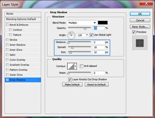
In this and the next two steps we are going to add Blending Options to our Arrow 18 shape in order to give it awesome relief and to make it more prominent.
Firstly apply Drop Shadow. Change only its Distance to 0px, Spread to 18% and Size to 10px.
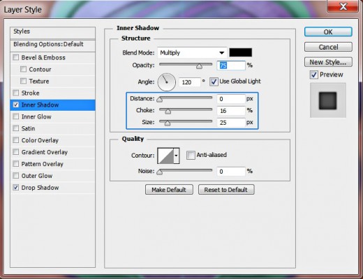
STEP 28
The second Layer Style to be applied on the Arrow is Inner Shadow. Change the following three settings- Distance: 0px, Choke: 16% and Size: 25px.
STEP 29
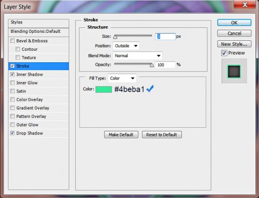
Now apply Stroke Layer Style of light green color. Don't modify its default settings, only change the Color of Stroke to #4beba1.
STEP 30
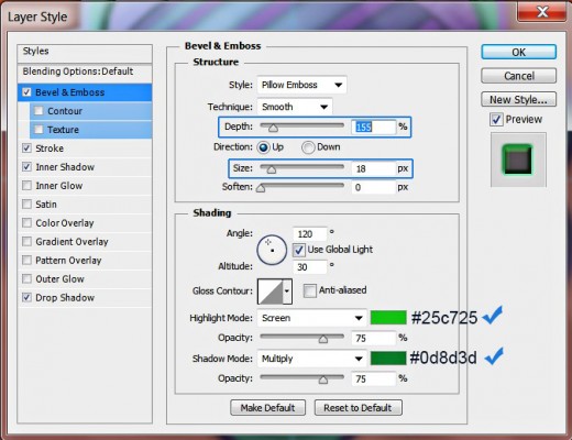
The last Layer Style to be added to the Arrow layer to make the shape looking 3D is Bevel and Emboss. Firstly change its Depth to 155% and increase the Size to 18px then set the Color for Highlight to #25c725 and the color of Shadow to #0d8d3d.
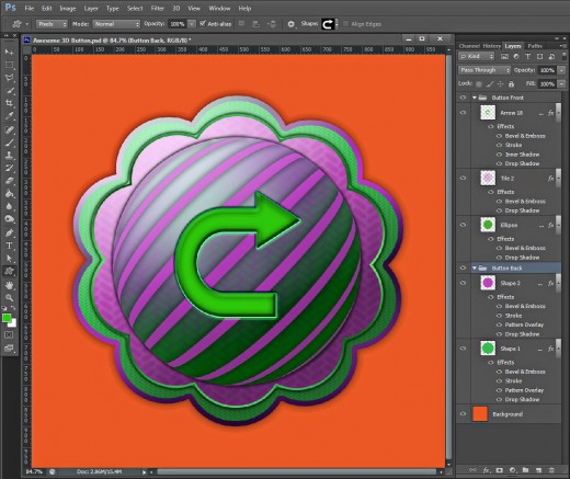
Our work on the 3D Button is done. Compare your Layers panel with the result shown on my screenshot below. If you have precisely followed all previous thirty steps, you should have these groups and layers:
-
One separate Background layer;
-
Button Back group with these two layers in it: Shape 1 and Shape 2 and
-
Button Front group which includes these three layers: Ellipse, Tile 2 and Arrow 18.
STEP 31
This is our 3D button saved in .jpg format. You can sharpen the edges a bit if you like, just go to Filter, Sharpen, Unsharp Mask and adjust the settings according to your taste.
Hope you learned new techniques from this tutorial and found it useful. Thanks a lot for reading. :)